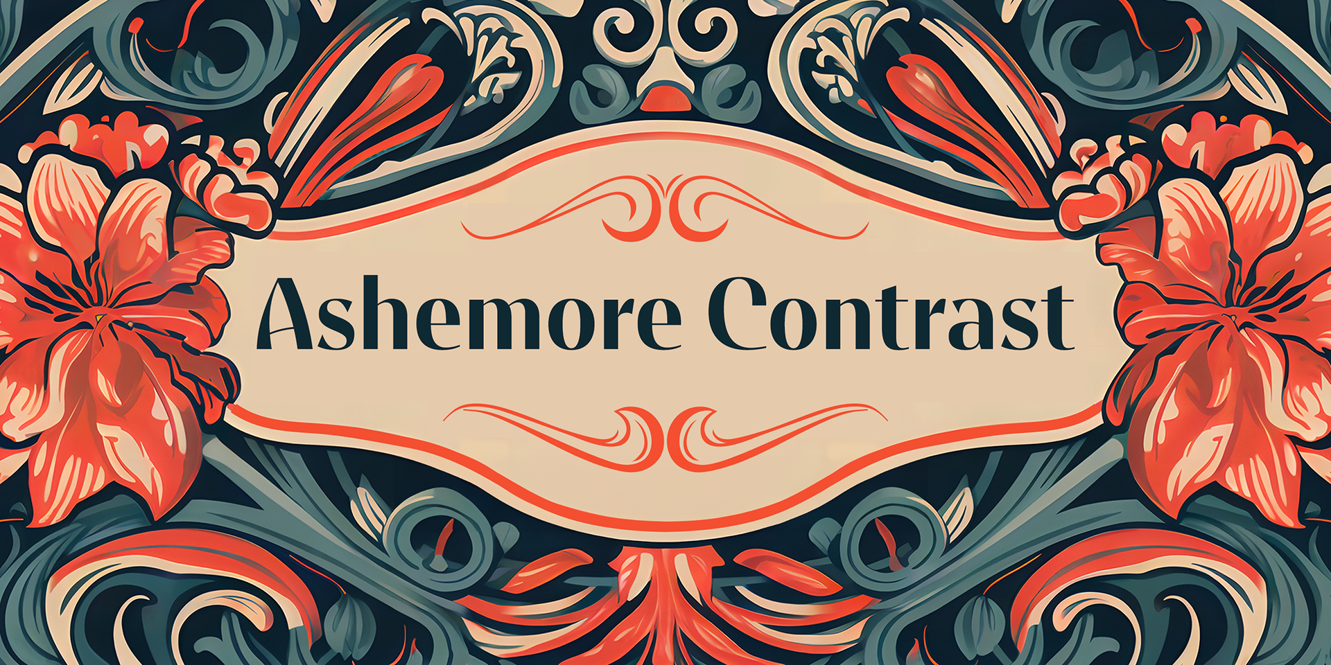
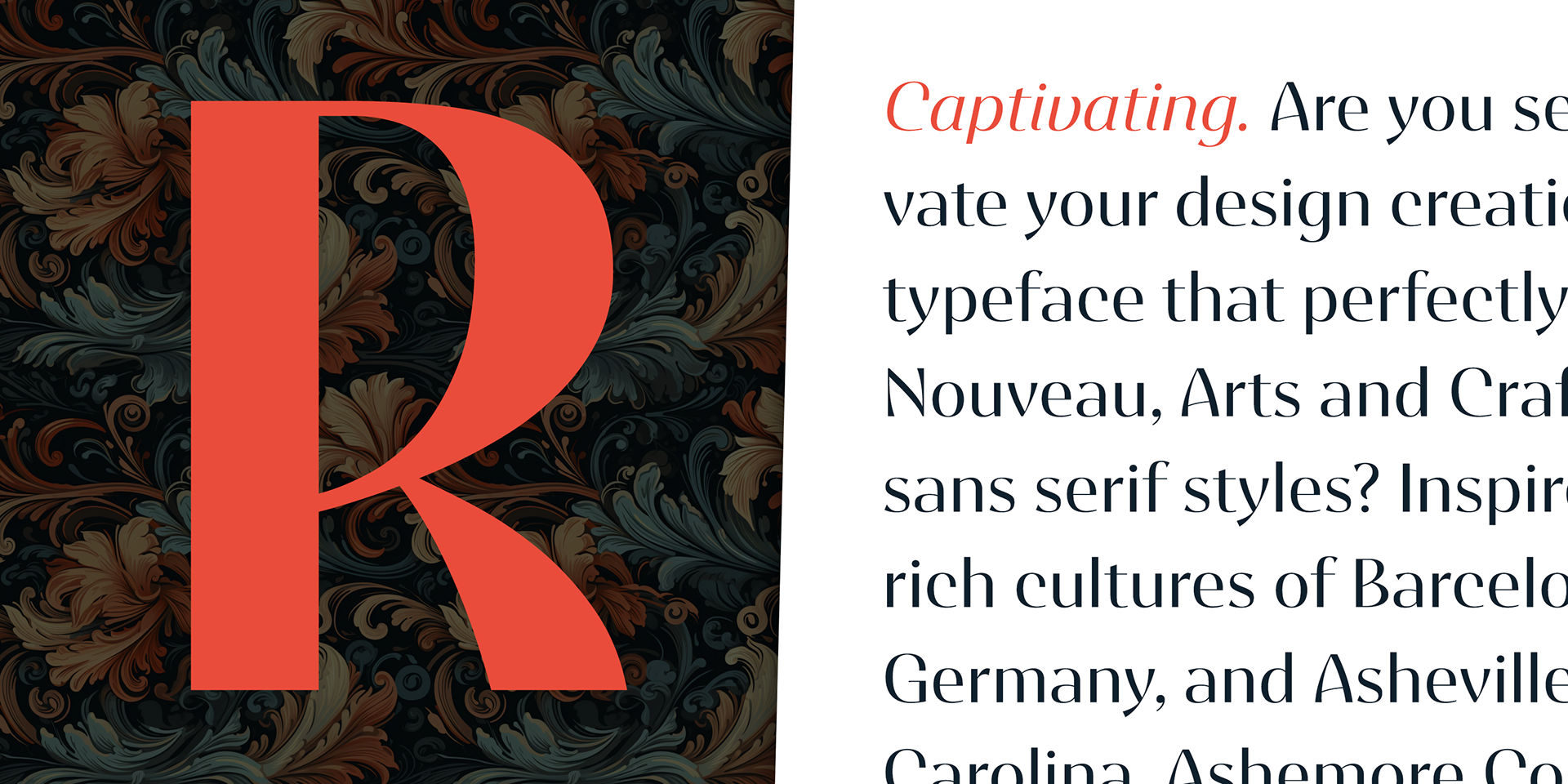
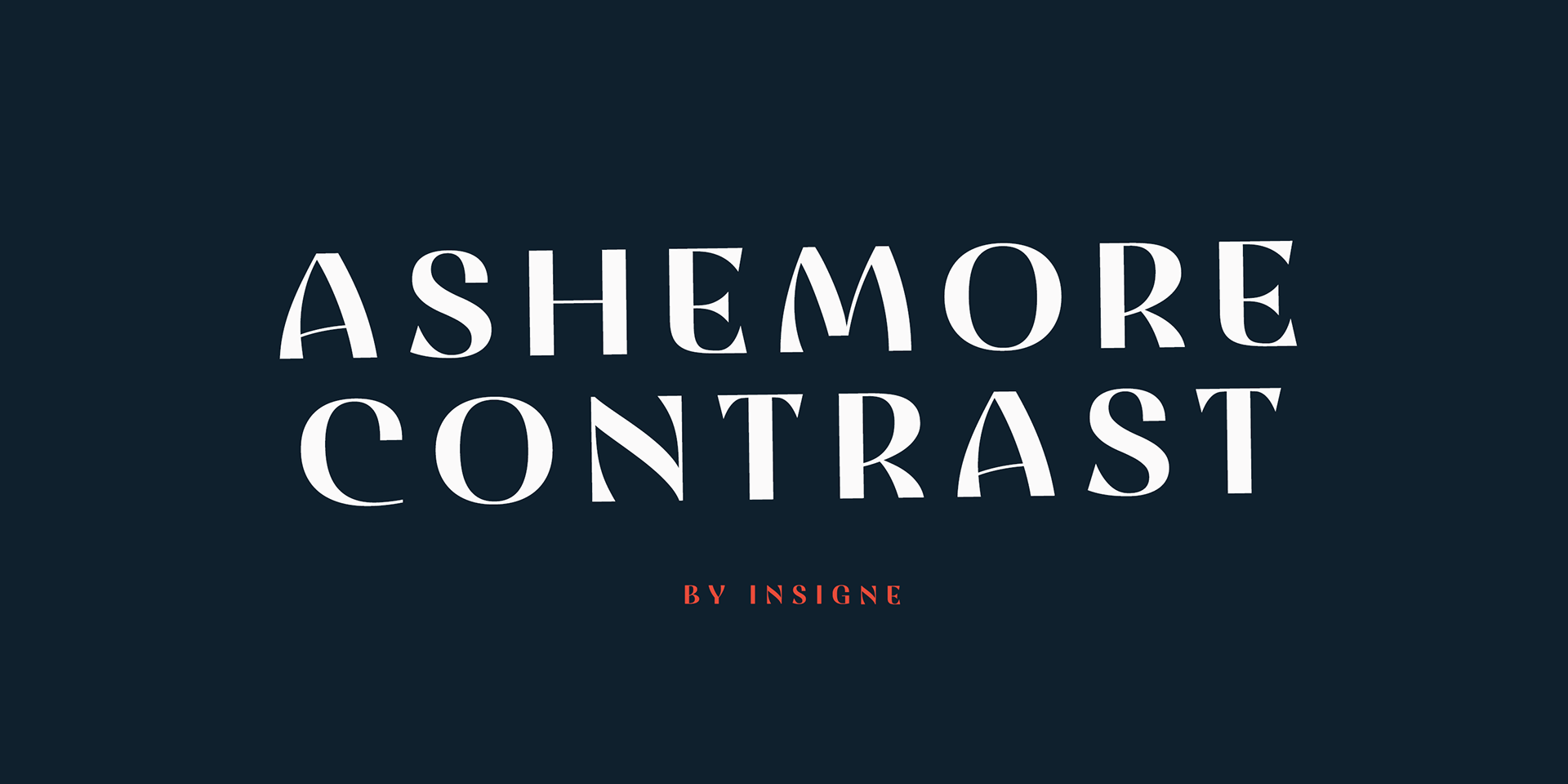
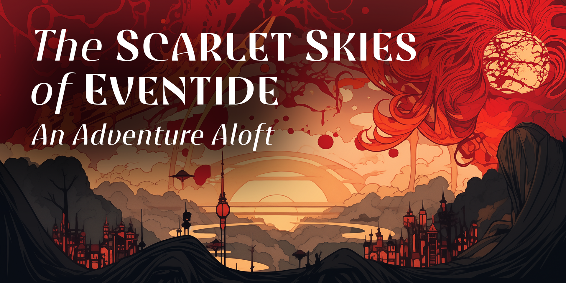


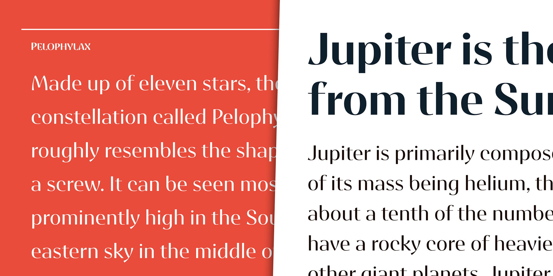
Are you set to elevate your design creations with a typeface that perfectly fuses Art Nouveau, Arts and Crafts, and sans serif styles? Inspired by the rich cultures of Barcelona, Spain, Germany, and Asheville, North Carolina, Ashemore Contrast is the enchanting blend your projects have been waiting for.
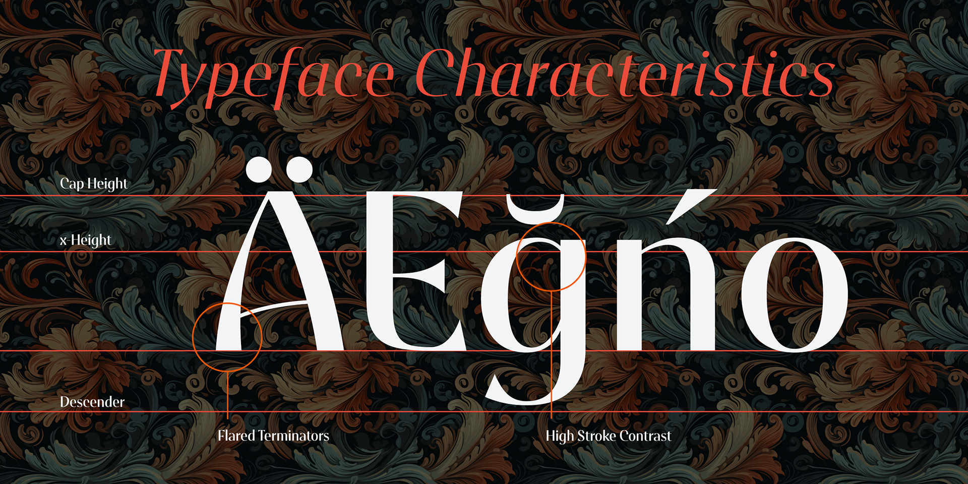
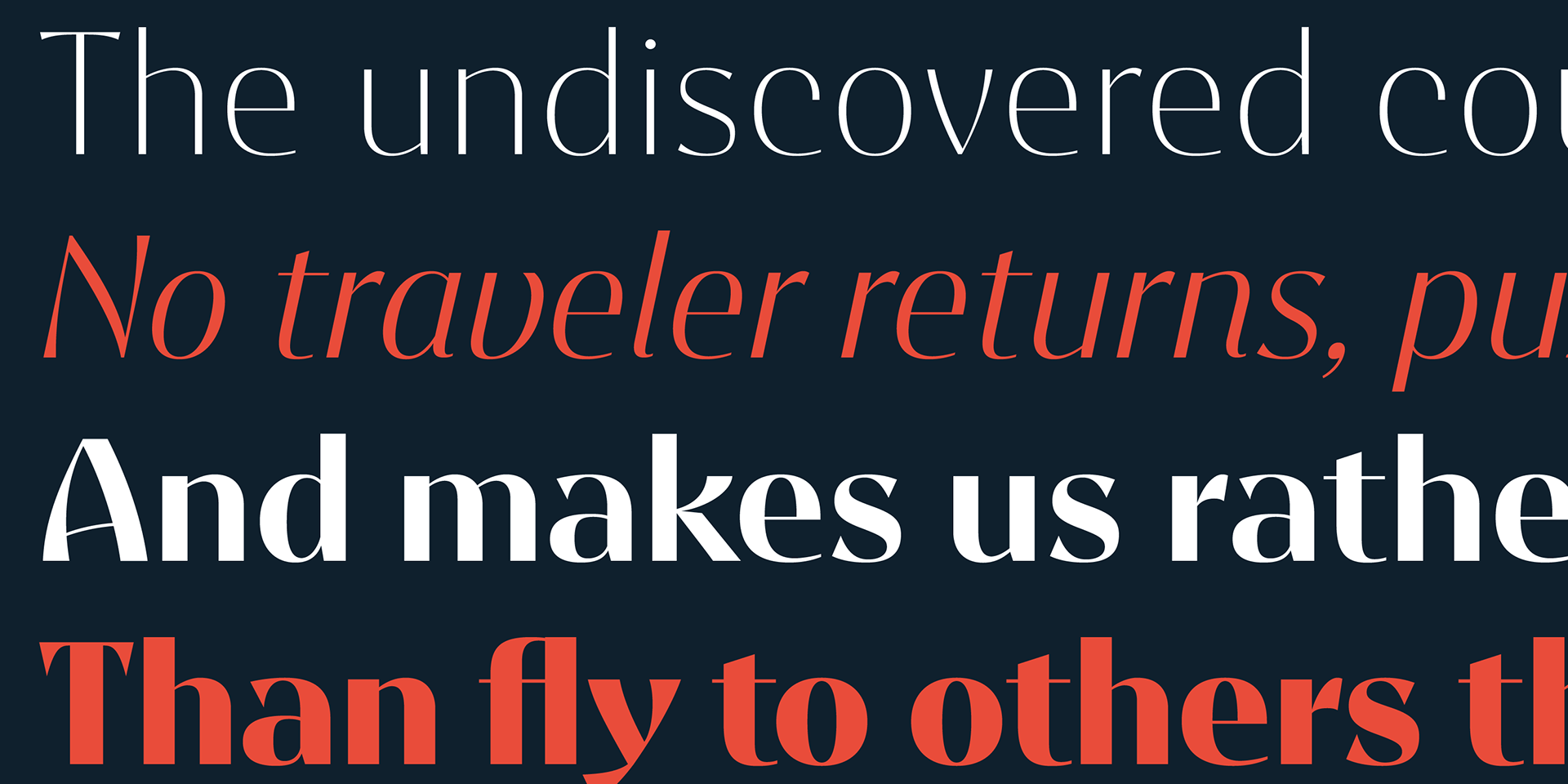
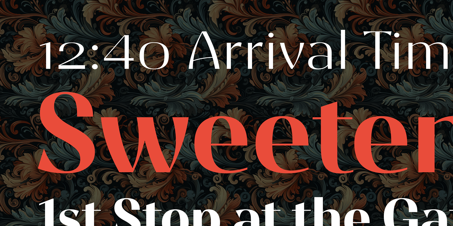
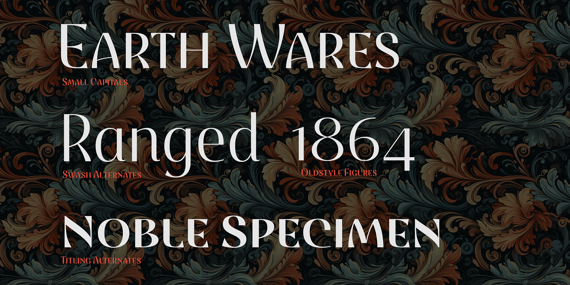
Boasting a sophisticated high contrast stress, Ashemore Contrast weaves elegance and refinement into your designs while maintaining the essence of Art Nouveau and Craftsman styles. The distinctive terminators of the C, G, and S characters add an exclusive touch, making this font an impeccable match for high-end coffee houses or avant-garde art galleries.
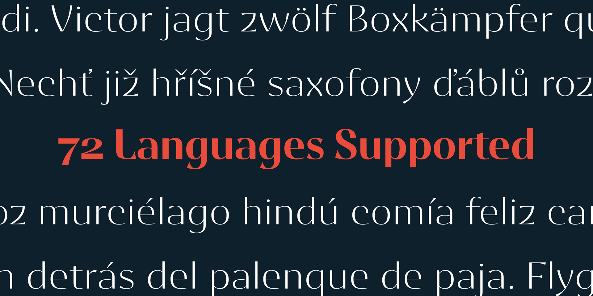
Ashemore Contrast is part of the comprehensive Ashemore family, offering weights from thin to black, along with condensed and extended options, resulting in a stunning 54-font ensemble. OpenType alternates, small caps, and an abundance of alternate characters position Ashemore Contrast as a versatile and dynamic choice for all your professional typography endeavors.
Unlock the typeface's remarkable features, including automatic ligatures and alternates, using OpenType-capable applications like Quark or the Adobe Suite. With support for over 40 languages that use the extended Latin script, Ashemore Contrast is the premier choice for multilingual publications and packaging.
Elevate your design prowess with Ashemore Contrast and delve into the exquisite union of Art Nouveau and contemporary design. Embrace the opportunity to metamorphose your projects with Ashemore Contrast and unlock the boundless potential of your creativity today!
60% off for a limited time.
60% off for a limited time.