


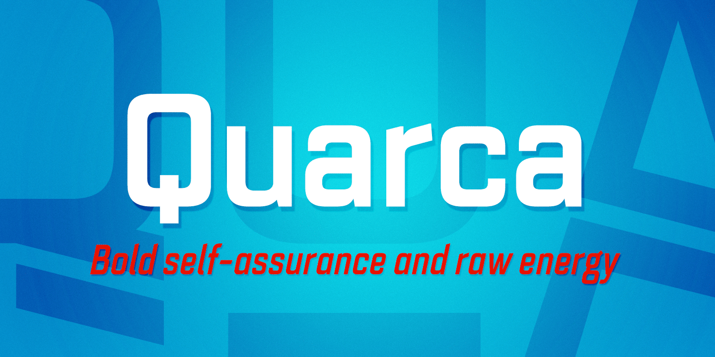

Quarca’s masculine power runs strong across the page with bold self-assurance and a raw energy that courses through its thick veins.
Don’t think the continuous, smooth geometry of this semi-modular face is captively chained to the grid, though. Quarca has been cautiously optimized to engage the reader’s eye. Achieving an attractive balance to its sturdy design, the open forms of this “rounded square” geometric sans--together with a tall x-height--make the font legible even when using the compact widths. This high-impact typeface definitely doesn't sacrifice versatility for style.
These compact widths, with their raw heart and strength, are perfect for callouts, while the extended widths provide you with the platform for a punchy and extremely efficient headline. The font has a thinner weight and transcends to an intense bold. The face’s geometric or technological construction also tends to make it right at home on the web.
The family consists of 36 fonts--six weights plus italics. Where Quarca truly stands out, though, is its wide number of OpenType typographic choices and optional glyphs, allowing you to design your piece with a personal, one-of-a-kind variant touch. These variations consist of Experimental Capitals, Angled Capital Terminals, and “Future Stencil.” In all, you can find more than one hundred of these alternate glyphs.
Quarca is well-suited for anything you are able to throw at it. Devised for today's multi-disciplined designer, this clear and infinitely versatile family provides tremendous value to your toolbox.
